
KidsActivities UI/UX Case Study
Product Overview
The Product:
An intuitive, family-friendly website that helps parents quickly discover, compare, and register their children for the right extracurricular activities with ease.
The Problem:
Many families struggle to navigate complicated registration sites that lack clear information, flexible filters, and accessibility options. This makes it difficult for parents to confidently choose programs that meet each child’s unique needs. The current process is often overwhelming, time-consuming, and not designed with diverse users in mind.
The Goal:
Create an intuitive interface for all sorts of users who have the goal of registering kids for extracurricular activities.
My Responsibilities:
Conduct user research
Define the problem and provide insights to inform the ideation phase
Define personas, user journeys, empathy maps, and user flows
Visual design of low-fi and high-fi wireframes, prototypes, and user testing
Project Duration:
14 Weeks
My Role:
This is an individual project that allowed me to plan and direct each step of the design thinking process as a UX design student with mobile and web UI design experience.
User Research
Going into the research process for this project, I had the assumption that parents wanted to shove their kids into extracurricular activities so that they could have more time for themselves. The actual research showed that parents wanted their kids to find a sense of community, build social skills, and find what passions they may have early to invest in them. The results also showed that the issue is not always necessarily finding activities, but learning if those specific activities cater to the needs of their family.
Discovered Pain Points
Community
Parents want to be able to search for activities based on how small or big the groups for the activity tends to be. This also includes age range.
Time Commitment
Parents want to be able to search for activities based on how much time they have and are willing to put in.
Experience Level
Parents want to be able to search for activities and groups that will help their kids grow in the specific activity.
Accessibility
Parents want to find activities that cater to their kids’ needs and don’t discriminate against any challenges they may have.
Using these pain points, I created a set of user personas and a journey map to represent the average experience of a user. The process for creating the journey map was filled with research on how other services handle registrations. From summer classes to sports to investment services.
User Personas and Journey Maps

Starting the Design
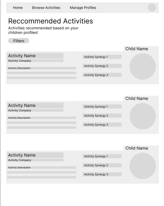
Quick breakdown of the activity with emphasis on how that activity will synergize with the child.
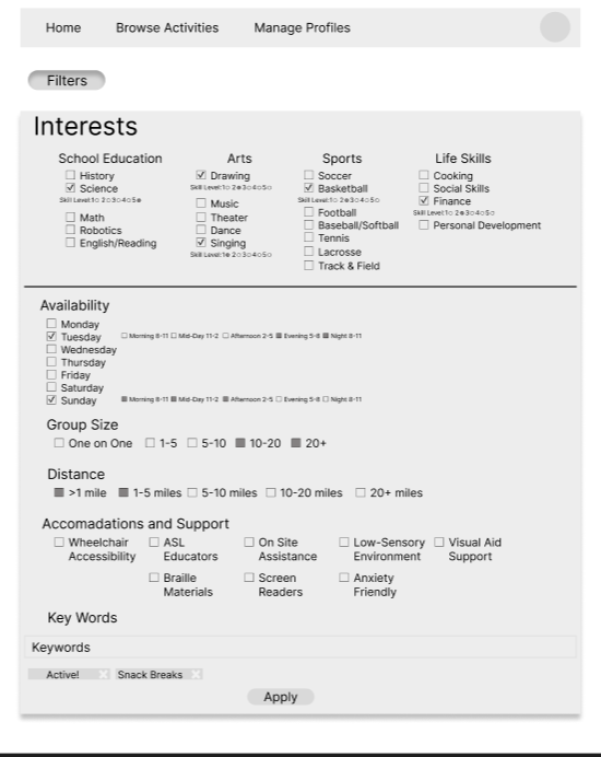
Ability to search based on the interests that have been submitted, but also able to filter through other options to find spaces to push past comfort zones.
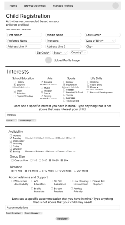
An area to write keywords within the interests section to help the system narrow down activity selections. Filters such as availability, group size, distance, and accommodation support.

This area will display parent or guardian reviews, including star ratings and short written feedback, to help users quickly gauge the quality of the activity.
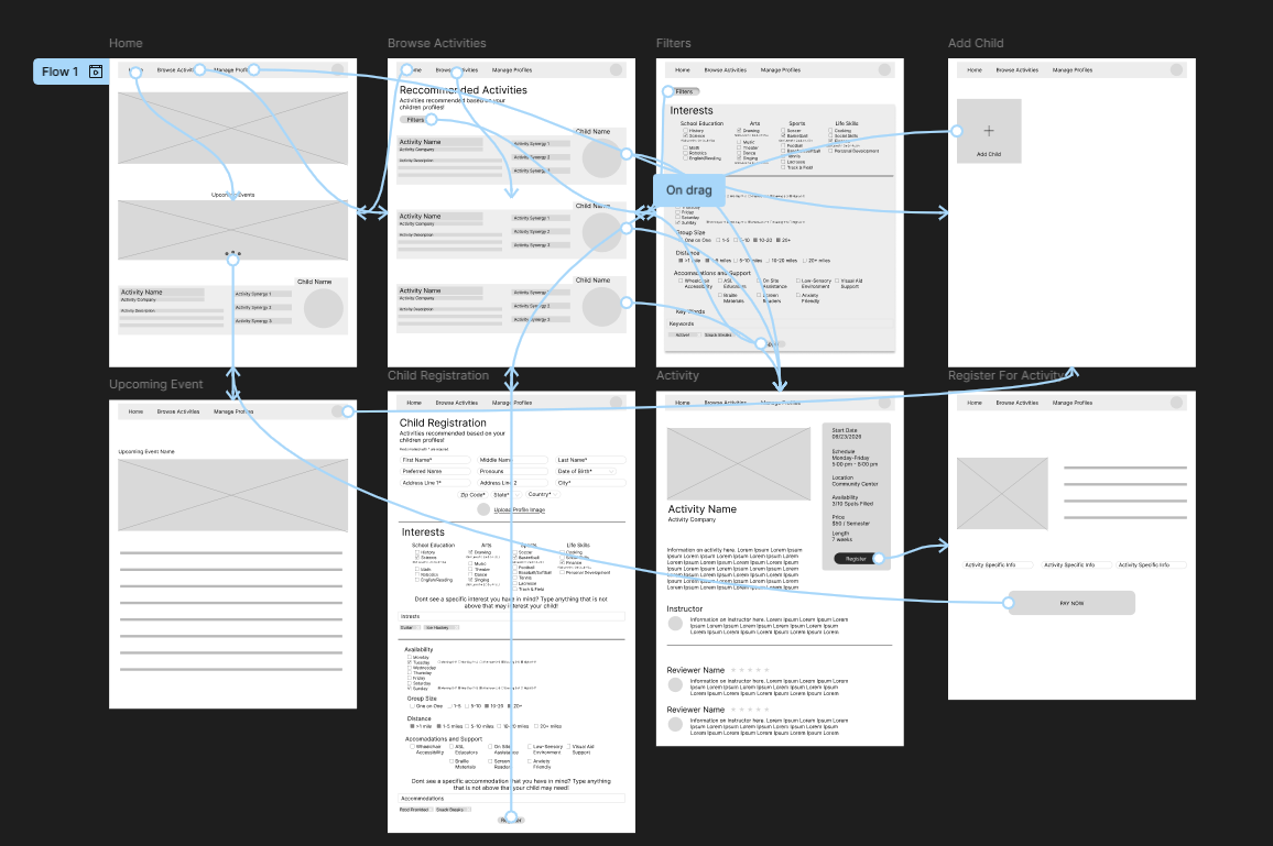
Low-fidelity Interactive Prototype
Using these pain points, I created a set of user personas and a journey map to represent the average experience of a user. The process for creating the journey map was filled with research on how other services handle registrations. From summer classes to sports to investment services.
Usability Study and Insights
I conducted two usability studies to evaluate how easily parents and guardians could navigate the website to find and register their children for extracurricular activities. Participants were asked to complete core tasks such as filtering activities, registering a child, and enrolling in activities. The findings revealed that users appreciated the clear layout and filtering options but suggested improvements for simplifying the enrollment process and making accessibility features more visible. Below are the key insights that I discovered
2
Users are looking for a more visually engaging interface
Users need a way to track and manage their registered activities
4
Users value simplicity but still need clarity in navigation
Users want a mobile-friendly experience with touch-appropriate elements
3
1
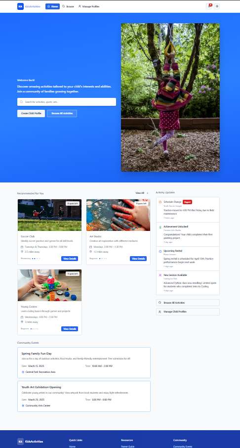
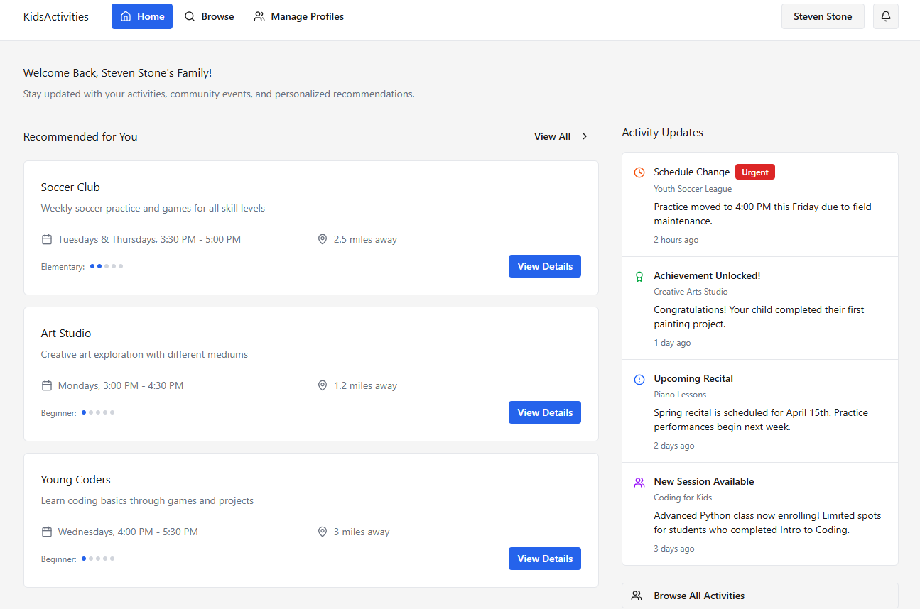
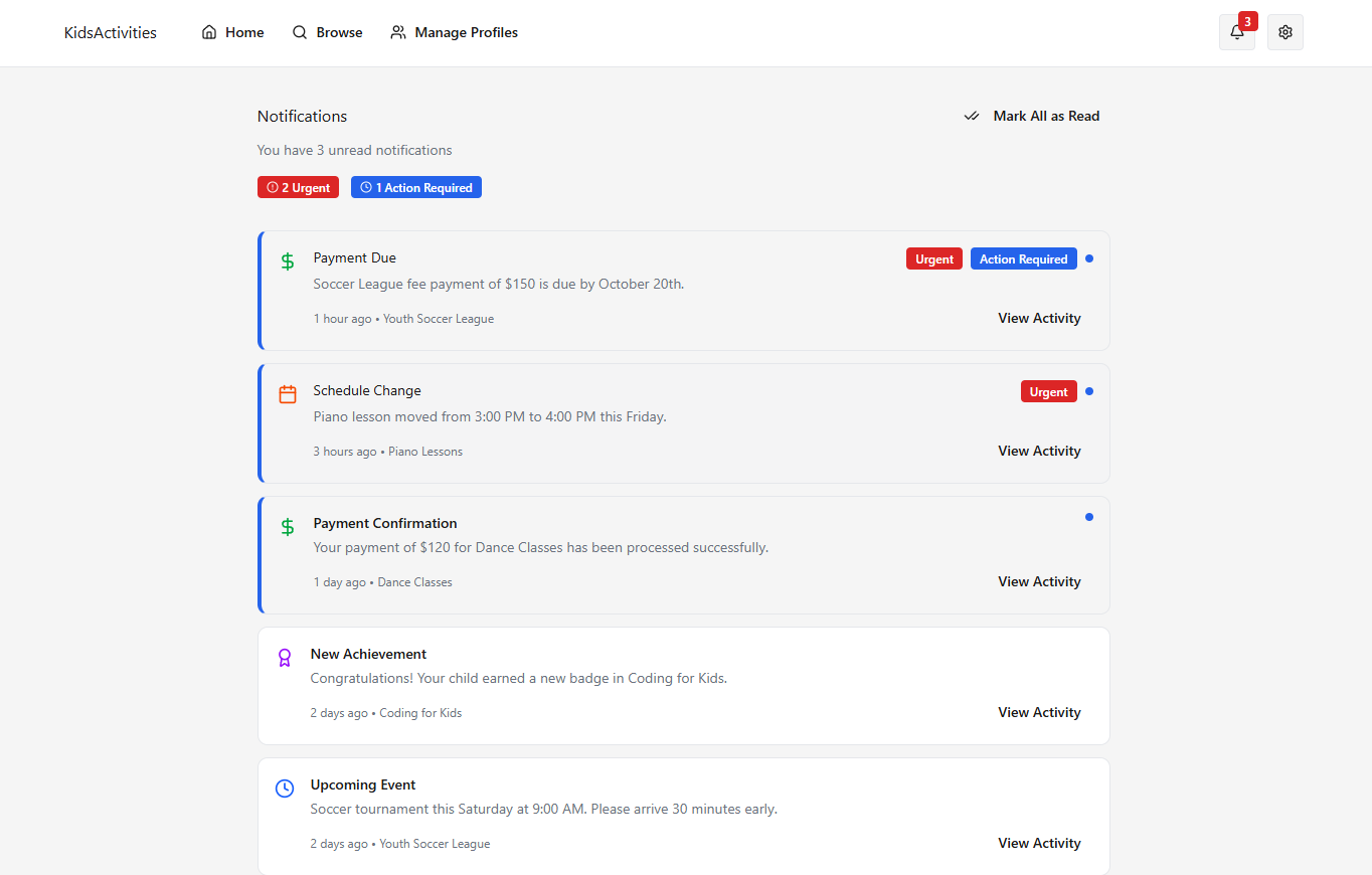
Mockups and Hi-Fidelity Prototype
Using the insights that were gained through the usability study, I pushed the design further in the mockup phase and created the Hi-Fi prototypes. Below are screenshots of the website and a link to the website itself.


Post Project Reflection
Designing Kids Activities reinforced the importance of user-centered iteration and thoughtful usability testing. Through continuous feedback, refinement, and validation across both desktop and mobile experiences, I learned how clarity, accessibility, and emotional ease can coexist when navigation, labeling, and interaction patterns are shaped around the real needs of families. By applying principles of visual hierarchy, intuitive information architecture, and inclusive design, each component evolved into a system that reduced friction, supported decision-making, and made registering for activities feel more approachable. The project ultimately demonstrated how intentional UX design can simplify complex tasks, build user confidence, and create a supportive, stress-free experience for a diverse set of parents and guardians.